With the newest installment of Batman currently in the filming stages, I thought it would be a good time to take a look at the Batsuit as it has changed across the years. Most importantly, I'd like your opinion...which Batsuit did you like best? Worst? Use the comment section and share your opinion!
BATSUIT I

This is the suit worn by Adam West in the original Batman movie which was adapted from the TV show. Really, one of the least practical, and less appealing suits of them all. Remember, Batman has no powers, so he has to rely on his suit to help him fight crime, and this suit really does nothing but carry a utility belt that amounts to a giant fanny pack. Also, not a big fan of the emblem placement...below the chest and right above the belly. Looks wise, this suit looks more like a childs home made Halloween costume than it does a superhero suit.
BATSUIT II

This suit was donned by Michael Keaton in Tim Burtons 1989 Batman. The suit obviously takes a darker approach to the caped crusader, and is actually quite a bit more practical when it comes to crime fighting. The black suit utilizes body armor, a utility belt and a nifty bat symbol. The one setback to this suit is the cowls inability to let the wearer turn his head from side to side. Other than that though, in my opinion, this suit is pretty solid, and one of my favorites.
Batsuit III

Keatons second turn donning the cowl brought us Batman Returns, and a new batsuit. The most obvious change here, is the suit uses a more plated body armor look, as opposed to the muscle shaped armor of the previous suit. Another notable change is the bat symbol. While similar to Keatons first Batman symbol, this one offers a sleeker appearance, and is by far the most widely used, and recognized bat symbol throughout the world. The cowl itself is fairly similar to the first one, but there are some small changes, barely noticeable.
Batsuit IV & V

I've put these two suits together, because they both make appearances in Batman Forever, the next movie installment of the franchise, this one directed by Joel Schumacher. Gone is Michael Keatons Batman, and in his place, Val Kilmer.
The first suit (Suit IV) has a darker black look to it, and goes back to the muscle shaped body armor. Also, one of the most widely panned features were the horrid "bat nipples" the suit incorporated. You'll note that the suit also strays away from a yellow utility belt, and goes to a sleeker, silver/black belt instead that almost looks like it belongs more in a fantasy movie than a Batman movie. The symbol stays largely the same, with the exception of the background using a color that seems more gold than yellow. B
By the end of the movie, Two Face has destroyed all of Batmans costume, and he is forced to go to a prototype costume (costume V). This costume, strays the furthers from the first three, in that pretty much every detail about it is different. You'll note the suit has more of a dark silver tone instead of black. The cowl is also quite a bit more sleek than it's predecessor, and includes a couple of added points on each side of the face. The most notable change, is that the bat symbol has been replaced, and in it's place, a giant bat across the entire chest of the suit. The oval emblem outline and yellow/gold color are gone as well. The body armor has also changed to a more futuristic look, and really gives a more high-tech look to the suit.
Batsuit VI & VII

Once again, I'll put these suits together, because they both appear in the same movie...Batman and Robin. This time, George Clooney takes his turn donning the cape and cowl of the Dark Knight, and the suit takes some turns changing as well.
The first suit to make an appearance in the movie, is a solid black suit, with muscle-like body armor. The bat symbol is smaller, and contained once again in an oval outline, however there is no yellow or gold in the background...just a raised black symbol on a black background. The utility belt looks a little better compared to its predecessor, and the cowl stays with a sleek look. Overall, the suit is not bad, save for the "bat nipples" that unfortunately make another appearance...one myself, and apparently many other fans could have done without.
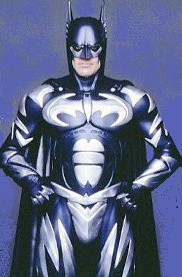
The second suit Clooney wears, is in my opinion, the worst suit of all. Incorporating a silver/black mix makes for a horrible looking suit. Like in the previous movie, the emblem has been emblazoned across the entire chest, forsaking the outline. The body armor has taken a more plated futuristic look, and the belt...well, is more of a decoration than a belt. (Also, why are we drawing so much attention to the "bat crotch?" The lightning bolts on the legs are also horrendous as are the notches in the side of the cowl. Not sure who was smoking what when this costume was designed, but its horrible.
Batsuit VIII

This is the first batsuit of the new Batman franchise, directed by Chris Nolan. The first suit we see, donned by Christian Bale in Batman Begins is not a bad looking suit...actually, in my opinion, one of the better ones. The suit is mostly solid black, withe a dark gold utility belt. The cowl has taken a shape that conforms more to the wearers head and looks a bit more menacing. One of the biggest changes here, is the first major change in the bat symbol in quite a while. Gone is the oval border, and yellow background, and in it's place is a different shaped bat emblazoned across the chest of the suit. The body armor takes on a more natural look in blending in with the suit, which fits well with the story line of the costume coming from that of a military developer.
Batsuit IX
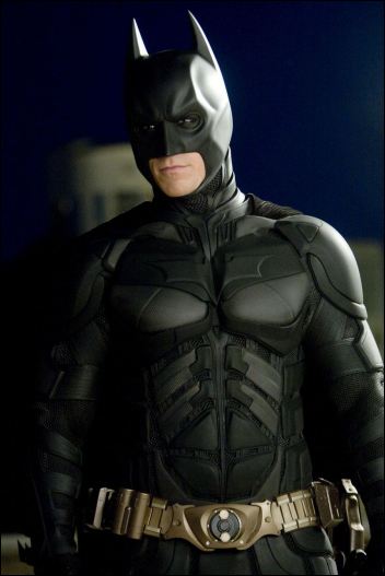
The most recent batsuit worn by Christian Bale in The Dark Knight looks less like a superhero suit and more like a piece of modern body armor, which is actually...what it is. The bat symbol has been shrunk a bit, and doesn't quite take up the entire chest as it did in the previous movie, but its still larger than it was in the previous franchise. The utility belt and largely unchanged, and the biggest difference other than the look of the suit, is the wearers ability to move much more freely than in previous suits. This is the first suit to actually allow the wearer to turn his head in the suit, so that is a major plus. The suit does have it's drawbacks however, and that is the that the spots between the pieces of body armor, which are more visible in this suit, allow for easier injuries to Batman. The cowl, is another big change...not only can the user move the head freely since the head piece is completely separate, but it is also the most form-fitting cowl yet..which in my opinion makes it look a bit silly. All in all though, the increased mobility, outweighs the increased risk the suit offers.
There you have it! My assessment of the evolution of the Batsuit. I'll even go a step further and rank them below...which I think are the best, and the worst. Use the comment section to tell us which you think is the best, and which you think is the worst. In the meantime, here is my rank...#1 being the best, and #9 being the worst:
9. 
8.
7.
6. 
5.
4.
3. 
2.
1.
1 comment:
I have the Val Kilmer sonic suit.
Post a Comment